Category: Uncategorized

  • How Custom Coffee Sleeves Are Printed: Board, Ink, and Order Size

    How Custom Coffee Sleeves Are Printed: Board, Ink, and Order Size

    A coffee sleeve is a small canvas with a stubborn surface. Most of the disappointment people feel when a custom sleeve arrives comes down to one thing they did not plan for: the way ink actually behaves on the board, at the color count they chose, in the quantity they ordered. None of that is complicated once you see how the pieces fit, and getting it right is the difference between a sleeve that looks intentional and one that looks like a compromise.

    Your artwork meets the board, not a screen

    The first fork in the road is the substrate. A natural kraft sleeve is brown, and brown is not a neutral background the way white is. Ink laid over kraft mixes visually with the base color, so a bright green comes out noticeably duller and softer than the same green printed on white board. This is not a printing defect; it is how a semi-transparent ink interacts with a colored surface. The practical takeaway is direct: if your brand look is built on a single confident color, kraft with black or white ink looks clean, minimal, and deliberately crafted, and you never have to worry about muddy color. If your design depends on vivid full-color artwork or a photo, specify a white sleeve instead, where the ink can sit on a neutral base and stay vibrant.

    Corrugated sleeves add a second wrinkle, literally. The fluted texture that gives a sleeve its grip and insulation also means the printing surface is not perfectly flat. Fine hairlines, small reversed-out type, and heavy solid coverage are less forgiving on a corrugated face than on a smooth flat board, so simple, bold artwork holds up better than intricate detail.

    Three ways a sleeve gets printed

    Custom sleeves are decorated with the same family of processes used across paper packaging, and the one you land on is usually decided by your quantity more than your taste. Digital printing lays down full CMYK with no printing plates, which means no per-color setup charge and the ability to run small batches, typically in the 500 to 1,000 range. It is the natural home for short runs, event orders, and anyone who wants to test a design before committing. Offset printing steps up image quality, handling CMYK plus spot colors with photographic detail and smooth gradients, and sits in the middle for volume. Flexographic printing uses plates and is built for scale; it reproduces one to six spot colors cleanly and becomes extremely efficient once you are into tens of thousands of pieces, which is why its minimum orders start high.
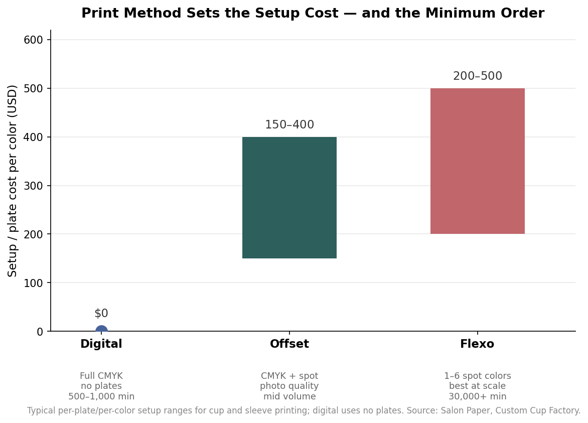
    Bar chart of setup or plate cost per color for digital, offset, and flexographic sleeve printing
    Setup cost per color by print method: digital uses no plates, while offset and flexo carry per-plate charges that pay off at volume.

    The reason to understand the three is that they are not interchangeable at every size. Asking a flexo line for 800 sleeves makes no sense, and asking a digital press for a photo-perfect gradient across 50,000 units is leaving money and quality on the table. Match the method to the run.

    Spot colors, CMYK, and why “match my Pantone” is a conversation

    Color is where budgets and expectations meet. Spot-color processes like flexo carry a real setup cost per color, commonly in the range of a couple hundred dollars up to around five hundred dollars for each color or plate, which is exactly why a one-color or two-color design is dramatically cheaper to run at volume than a busy full-color layout. Digital sidesteps plates entirely and gives you full color for no setup, but its CMYK output can look slightly less punchy than an offset spot color, and a specific brand Pantone will land close rather than dead-on. On kraft, that gap widens because the brown base pulls the printed color toward a warmer, muted version of the swatch. The honest way to handle brand color is to treat it as a discussion with your printer: decide whether you need a spot ink matched carefully or whether a good CMYK approximation is fine, and either way ask to see the color on the actual board before you approve a full run.

    How quantity rewrites the math

    Nothing moves the per-sleeve price like volume, because a large share of a small order is fixed setup spread across very few pieces. At a 500-piece run, full-custom sleeves commonly land somewhere around $0.80 to $1.00 each, carrying that setup premium. Push the same job to roughly 30,000 pieces and the unit cost can fall to about $0.04 to $0.05 each as the fixed costs disappear into the quantity. Those are indicative bands, not quotes, and they vary by artwork, material, and supplier, but the shape of the curve is real and worth internalizing before you decide how many to buy.
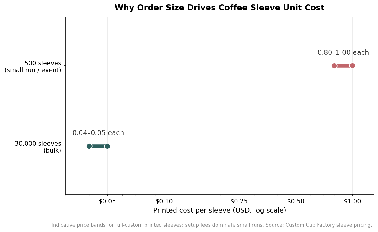
    Range plot comparing printed cost per coffee sleeve at 500 units versus 30,000 units on a log scale
    Per-sleeve cost falls from roughly a dollar at 500 pieces to a few cents at 30,000 as setup fees spread across the run.

    Lead time follows the same logic. A full-custom bulk order commonly runs on the order of eight to twelve weeks from artwork approval to delivery, so a large economical run is something to plan seasons ahead, not something to order the week before a launch. If you need sleeves fast or in small numbers, a digital short run costs more per piece but buys you speed and flexibility.

    Choosing for your situation

    Put the three decisions in order and the choice makes itself. If you are a small cafe, a pop-up, or running an event, a digital run of 500 to 1,000 on the substrate that suits your art is the sane starting point, and if your look leans minimal, kraft with one ink keeps it cheap and handsome. If you are an established shop going through sleeves by the case every week, planning a large flexo or offset run in one or two spot colors is where the per-piece cost becomes almost negligible, provided you can commit to the volume and the lead time. Above all, decide your substrate and color count before you fall in love with a design, because the board and the ink are what your customers actually hold, and they are the constraints every other choice has to respect.

  • How to Set Up Print-Ready Custom Coffee Sleeves: Dimensions, Print Method, and Files

    How to Set Up Print-Ready Custom Coffee Sleeves: Dimensions, Print Method, and Files

    A custom coffee sleeve looks like a simple band of board, but two decisions made before the file ever reaches a printer determine whether it fits the cup, prints cleanly, and lands on budget: the physical size you specify and the print method you choose for your quantity. Get either wrong and you are looking at a reprint, a sleeve that slides off a 20-ounce cup, or a bill that is double what it needed to be. This walkthrough covers how to specify a sleeve from dimensions through print-ready artwork so the first run is the one you keep.

    Start with the cup, not the sleeve

    Sleeves are sized to a range of cups, not a single cup, so the first question is which drinks the sleeve has to cover. A common corrugated kraft sleeve runs about 2.5 inches tall with a top opening near 5 inches and a bottom near 4.4 inches, which lets one size grip most 12-, 16-, and 20-ounce paper hot cups and many 16- to 24-ounce clear cold cups. That single size is convenient, but it has a real limit: sleeves cut for the 12-to-20 band frequently will not stay on an 8-ounce cup, because the cup’s taper is too narrow for the band to bite. If short cups are part of your program, plan on a second size rather than forcing one sleeve to do everything.

    Height matters as much as circumference. A taller band covers more of the cup and gives you more print area, but it also creeps toward the lid and the hand position. If your design leans on a logo that needs to sit upright and centered, confirm the print area on the flattened dieline before you commit, because the usable window is smaller than the full board once you subtract the glue seam and the curve of the wrap.

    Pick the print method by your order size

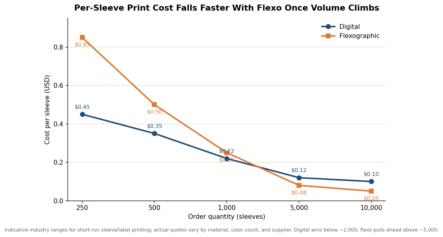
    The largest single swing in what a sleeve costs is not the artwork; it is whether the job runs digitally or on a flexographic press, and the break point is driven almost entirely by quantity. Digital printing carries no plate cost, so it stays cheap on short runs and is usually the right call below roughly 2,000 pieces. Flexo adds a one-time plate charge but then prints each unit for less, so it pulls ahead once volume climbs past about 5,000. Between those two numbers the answer depends on how many colors you run and the exact material.

    The per-unit picture below shows the pattern. At 250 to 1,000 pieces digital is level or cheaper; by 5,000 and 10,000 flexo has clearly taken over. The figures are indicative industry ranges rather than a specific quote, and your real numbers will move with stock, color count, and finishing, but the shape of the curve holds across suppliers.

    Line chart comparing per-sleeve digital and flexographic print cost across order quantities from 250 to 10,000
    Digital stays cheaper on short runs; flexographic overtakes it once volume passes roughly 5,000 sleeves.

    Two practical consequences follow. First, if you are testing a design or running a one-time event, do not let a printer talk you onto a press that needs 5,000 units to make sense; a digital short run exists precisely so you can order 500 without paying for plates you will never reuse. Second, if you know you will reorder the same art several times a year, the plate you pay for once on a flexo job amortizes across every future run, which changes the math in flexo’s favor even at moderate volumes.

    Design for kraft, and mind the white

    Most sleeves are printed on natural kraft or corrugated board, and that brown substrate imposes one rule that surprises first-time buyers: white usually cannot be printed. On kraft there is no white ink laydown on many sleeve lines, so any part of your art you imagined as white will simply show the brown board instead. If your logo depends on white type or a white knockout, you have three options: switch to a bleached white sleeve stock, redesign so the brown board becomes the light element, or accept that the “white” areas read as kraft. Decide this at the design stage, not at the proof, because it reshapes the whole layout.

    Color count also drives the flexo plate cost, which climbs with every additional ink. Plates commonly run on the order of $50 to $200 per color, so a two-color mark is far cheaper to tool than a six-color illustration. The chart below shows how the upfront plate and setup cost stacks up as colors are added; digital, by contrast, charges nothing for plates, which is another reason full-color photographic art tends to favor digital on shorter runs.

    Horizontal bar chart of upfront flexographic plate and setup cost rising with two, four, and six colors
    Every added ink color raises the one-time flexo plate cost; digital printing charges nothing for plates.

    A tight, two- or three-color design is not just cheaper; it is also more forgiving on an absorbent kraft surface, where fine gradients and small reversed type can fill in. Bold shapes and solid spot colors reproduce more reliably than delicate detail.

    Build a print-ready file

    Suppliers vary in their exact preflight requirements, and the honest answer is that bleed, resolution, and color targets are ultimately set by the approved dieline and the press, not by one universal number. That said, a few conventions travel well. Set up your artwork on the supplier’s flattened dieline and extend every background to the bleed boundary, typically around an eighth of an inch past the trim, so a slight shift on the die does not leave a white sliver. Keep logos and text inside the marked safe area, well clear of the glue seam where the wrap overlaps. Build raster images to roughly 300 dpi at final printed size, and remember that scaling a placed image up in the layout lowers its effective resolution even if the original file looked sharp.

    Supply artwork as editable vector wherever possible, an Illustrator, EPS, or press-ready PDF, and label which objects are process CMYK and which are Pantone spot colors so the printer matches your brand ink rather than guessing at a build. Always send a reference PDF alongside the source so the shop can confirm the file matches what you approved. These file habits are what separate a job that clears preflight on the first pass from one that bounces back with queries and adds days to the schedule.

    Confirm quantity, proof, and lead time before you sign off

    Sleeves are ordered by the case, and minimums are real: a single case commonly holds about 1,000 pieces, and volume discounts typically start at three or more cases, so ordering just over a case boundary can be poor value. Ask for a one-time setup fee figure up front; on corrugated stock it is often around $50 per artwork, separate from the plate costs on a flexo job. Build the calendar around production, too. Corrugated custom sleeves commonly carry a lead time near three weeks, with rush options sometimes landing in the 10-to-14 business-day range when a printer approves them, so an event four weeks out has little slack once art revisions are counted.

    The last safeguard is the proof. Approve a physical or high-resolution digital proof against the actual sleeve size and stock, checking that the design clears the seam, that any intended white is handled, and that spot colors are called out by number. A sleeve you specify carefully once becomes a template you can reorder for years; the effort you spend getting the dimensions, print method, and file right on the first order is what keeps every reorder fast, predictable, and on brand.

  • How Many Coffee Sleeve Sizes Do You Actually Need? A Cup-Fit Guide

    How Many Coffee Sleeve Sizes Do You Actually Need? A Cup-Fit Guide

    The most useful question a cafe or brand can ask before ordering custom coffee sleeves is not what they should look like but how many sizes they need to buy. It feels like every cup size should want its own sleeve, so people brace for a complicated matrix of SKUs. The reality is far simpler, and it comes down to one measurement that most cup charts bury: the rim diameter.

    The number that decides fit is the rim, not the volume

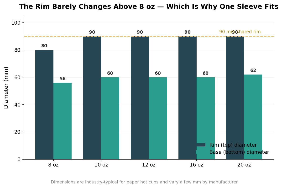
    A cup’s advertised size is a volume, but a sleeve does not grip volume. It grips the outside of the cup wall, near the lower third, and what matters there is diameter. Once you sort hot cups by their top diameter instead of their ounces, the picture collapses into two groups. An 8-ounce cup runs about 80 millimeters across the rim with a 56-millimeter base. Nearly everything above it, from 10 ounces up through 20, shares a rim of about 90 millimeters and a base right around 60 to 62 millimeters. That single 90-millimeter rim is the workhorse of the disposable-cup industry; it is why one plastic lid covers four different capacities, and it is why one sleeve does too.

    Grouped bar chart of hot cup rim and base diameters for 8, 10, 12, 16, 20 oz showing a shared 90mm rim above 8 oz
    Above 8 oz, hot cups share a ~90 mm rim and ~60 mm base, so one sleeve fits the whole range.

    Why one sleeve covers 12, 16, and 20 ounces

    Look at the base and rim numbers for the 12, 16, and 20 ounce cups and they are almost identical: the same 90-millimeter rim, a base within two millimeters of each other. The cups differ in how tall they are, not in how wide. Because a sleeve is a short band that sits low on the cup where the wall diameter is nearly constant across those three sizes, the same standard sleeve slides onto all of them and holds. This is not a loose approximation; it is how the supply chain is designed. A sleeve rated for 12 to 20 ounces, often sold as the standard size with a caliber around 90 millimeters, is doing exactly what the shared cup geometry allows.

    The practical consequence is that a shop pouring 12, 16, and 20 ounce drinks does not need three sleeve designs or three inventory lines. One standard sleeve, printed once, covers the entire large-drink range, which also means one artwork setup, one minimum order to hit, and one box to restock.

    Where the 8-ounce cup breaks the pattern

    The exception is the small cup. An 8-ounce cup is genuinely narrower, roughly 80 millimeters at the rim against the 90 of everything larger, and its base is smaller too. A standard sleeve built for a 90-millimeter cup will sit loose on it and can slide or spin, which is exactly the failure a sleeve is supposed to prevent. If your menu includes 8-ounce short drinks, espresso-forward cortados, or kids’ cocoa, that size needs its own smaller sleeve, typically an 80-millimeter caliber band. Ten-ounce cups, by contrast, already share the 90-millimeter rim, so they ride on the standard sleeve with the rest.

    So the honest answer to how many sleeve sizes most operations need is one or two. One standard sleeve if you only serve 10 ounces and up, and a second small sleeve only if 8-ounce cups are actually on the menu.

    Height, taper, and where a sleeve actually grips

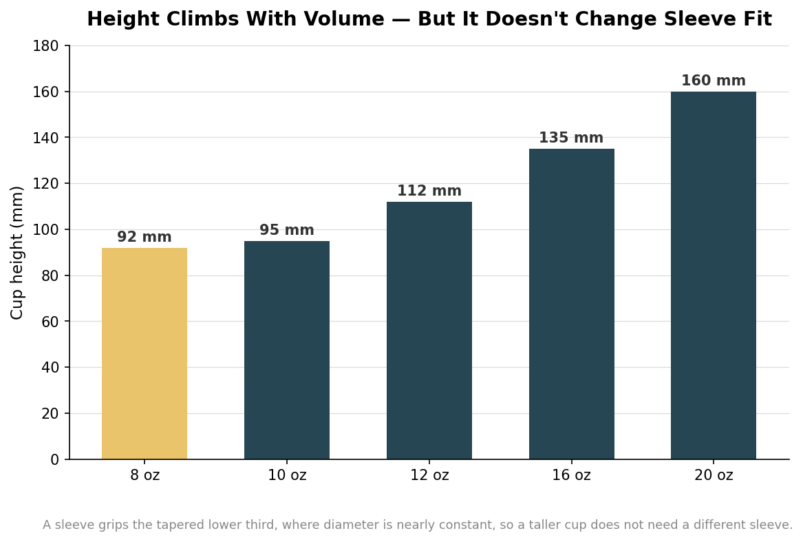
    It is worth being clear about why height does not enter the fit calculation, because it is the number that changes most across sizes. A 12-ounce cup stands about 112 millimeters tall, a 16-ounce about 135, and a 20-ounce about 160, yet all three take the same sleeve. The sleeve wraps a band a couple of inches tall around the lower portion of the cup, below the widest point, where the taper has brought the three cups to nearly the same circumference. A taller cup simply leaves more bare wall above the sleeve. That is also why you match a sleeve to a cup by measuring the diameter at the grip zone, not by reading the ounce number or the height off the box.

    Bar chart of hot cup heights from 92mm at 8oz to 160mm at 20oz
    Cup height rises steeply with volume, but the sleeve grips the lower wall where diameter stays nearly constant.

    One category sits outside this whole calculation: double-walled and ripple-wall cups. These build the insulation into the cup itself with a second layer or a corrugated outer skin, so the wall is already comfortable to hold and often needs no sleeve at all. If part of your menu uses double-walled cups and part uses single-wall, size sleeves only for the single-wall cups and treat the insulated ones as their own line. Layering a sleeve over an already double-walled cup is usually paying twice for the same warmth, and it can make the cup too fat to hold well.

    What to actually order

    Translate this into an order and it gets short. Inventory your cup menu by rim diameter rather than by advertised ounces, and you will almost certainly find your hot cups fall into the 90-millimeter group with at most a single 80-millimeter outlier for a small size. Order the standard sleeve for the 90-millimeter cups and, only if you serve 8-ounce drinks, add the small sleeve for those. Confirm the exact rim and base measurements of the specific cups you buy before committing to a print run, since figures vary a few millimeters between manufacturers and a sleeve that fits one brand’s 12-ounce cup snugly may sit slightly differently on another’s. Get those measurements right once and the sizing question, which looked like it needed a spreadsheet, turns out to need a single standard sleeve and maybe one small companion.

  • Recycled, Recyclable, Compostable: What Coffee Sleeve Eco-Labels Really Mean

    Recycled, Recyclable, Compostable: What Coffee Sleeve Eco-Labels Really Mean

    The eco-friendly language on a coffee sleeve is where a lot of good intentions quietly turn into indefensible claims. A cafe orders a natural-looking kraft sleeve, sees the words recycled and compostable on the supplier’s page, and prints “100% compostable” across the band, without noticing that the claim only holds under conditions the cafe does not control. Recycled, recyclable, and compostable are three different promises about three different moments in a sleeve’s life, and getting them straight is the difference between an honest sustainability story and a greenwashing complaint.

    “Recycled” describes what went in, not what happens next

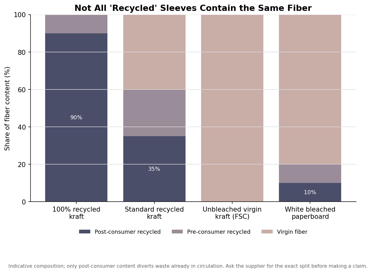
    A recycled claim is about the fiber the sleeve was made from, and the important distinction hides inside the word. Post-consumer recycled content is material that already did a life as a product and was diverted from a landfill, while pre-consumer content is factory offcuts that never reached a consumer. Only the post-consumer portion actually pulls waste back out of circulation, so a sleeve advertised as “100% recycled” with 90%-plus post-consumer fiber is doing far more environmental work than one that reaches its recycled percentage mostly through mill scrap.

    Stacked bar chart of post-consumer, pre-consumer, and virgin fiber content across recycled kraft, virgin kraft, and bleached paperboard coffee sleeve stocks
    Two sleeves can both be called recycled while containing very different amounts of post-consumer fiber.

    The practical move is to ask the supplier for the exact split before you print a number on the band. “Made with recycled material” is safe and vague; a specific “90% post-consumer recycled” is powerful but only if the certificate backs it. If you cannot get the breakdown in writing, keep the claim general rather than inventing a figure.

    “Recyclable” depends on the whole sleeve, not just the paper

    Kraft and corrugated paperboard are recyclable in principle, but recyclability is a property of the finished sleeve, not the raw stock. What tends to disqualify a sleeve is everything added after the fiber: heavy ink coverage, plastic lamination, foil, or a moisture coating can all push a sleeve out of the paper stream at a materials recovery facility. Because a sleeve barely touches the drink, it usually stays clean enough to recycle, which is an advantage over food-soiled packaging, but that advantage evaporates if the decoration is not paper-compatible.

    To keep a recyclable claim honest, favor uncoated stock and water-based or soy-based inks, and be cautious with full-bleed dark backgrounds that pile on ink. The plainer the construction, the more confidently you can say the sleeve belongs in the recycling bin, and the less you are relying on a hopeful consumer to guess.

    “Compostable” almost always means industrial, unless proven otherwise

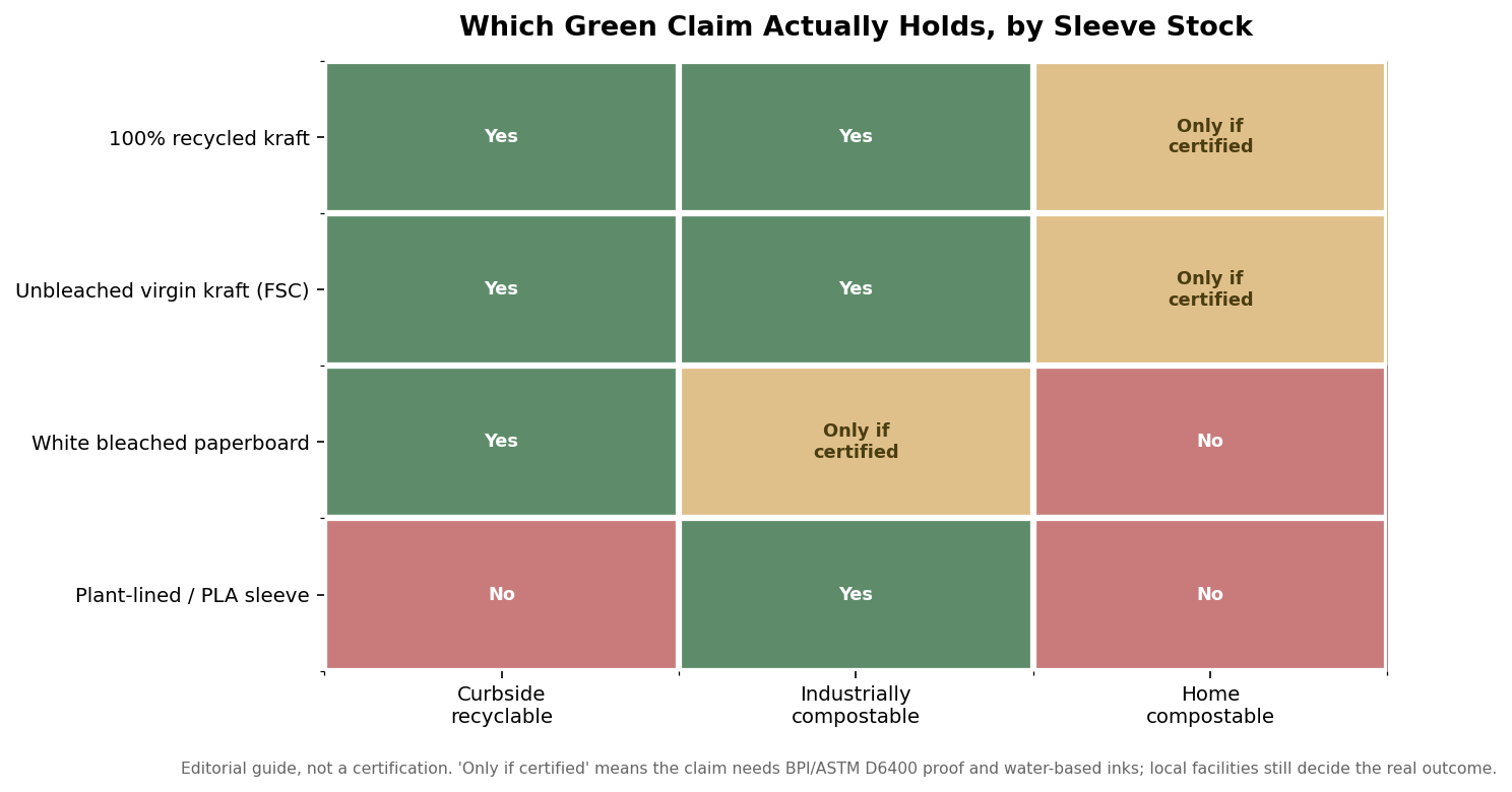
    Compostable is the claim that gets cafes into the most trouble, because the unqualified word implies something most sleeves cannot deliver. A defensible compostable claim rests on certification to a standard such as ASTM D6400, typically verified through a program like BPI, and that certification is for industrial composting, where sustained high heat breaks the material down. Home compost piles rarely reach those conditions, so “home compostable” is a separate, higher bar that most paper sleeves do not clear.

    Heatmap showing whether curbside recyclable, industrially compostable, and home compostable claims hold for four coffee sleeve stock types
    An editorial guide to which end-of-life claim survives for each stock; certification and local facilities decide the rest.

    Two things quietly control whether the claim survives contact with reality. The first is ink: a sleeve is only compostable when it is printed with compostable, usually water-based, inks, so a solvent-heavy print can void the certificate you paid for. The second is access, because a sleeve that is technically industrially compostable still ends up in a landfill if the customer has no commercial composting collection. Honest labeling acknowledges that gap rather than implying the sleeve disappears on its own. The safe wording qualifies the claim, as in “industrially compostable where facilities exist,” rather than a bare “compostable.”

    FSC is about where the fiber came from

    Forest Stewardship Council certification answers a different question again: not what happens to the sleeve, but whether its virgin fiber was responsibly sourced. An FSC chain-of-custody claim traces the paper back through the supply chain to well-managed forests, which is why FSC and recycled content are complementary rather than interchangeable. A sleeve can be FSC-certified virgin kraft, high in recycled content, or a mix, and each tells a distinct story. Using the FSC logo also requires a valid license tied to the certified supplier, so you cannot simply add the mark because your stock happens to be FSC somewhere upstream.

    For a buyer, the useful takeaway is to pick the origin story that matches the product and say only that. If the sleeve is recycled kraft, lead with the recycled content. If it is responsibly sourced virgin fiber, lead with FSC. Stacking every green word onto one band dilutes the credible claims and invites scrutiny of the weak ones.

    Making a claim you can actually stand behind

    The connecting thread is that each green word maps to a specific piece of evidence, and your printed claim should never outrun that evidence. Recycled maps to a content breakdown, recyclable maps to paper-compatible construction and inks, compostable maps to an ASTM D6400 or BPI certificate plus compostable inks, and FSC maps to a licensed chain-of-custody claim. In the spirit of the FTC’s guidance on environmental marketing, a claim should be specific, qualified where necessary, and substantiated by documentation you could produce if asked.

    Specify the sleeve, then, by starting from the claim you want to make and working backward to the stock, the ink, and the certificate that would make it true. Ask for the post-consumer percentage in writing, confirm the ink is compatible with your recyclable or compostable story, qualify a compostable claim to industrial facilities, and use the FSC mark only under a valid license. Do that, and the sustainability line on your sleeve becomes an asset you can defend rather than a liability waiting for a sharp-eyed customer, because every word on the band is backed by a document in your file.

  • Corrugated, Embossed, or Flat: How to Choose a Coffee Cup Sleeve

    Corrugated, Embossed, or Flat: How to Choose a Coffee Cup Sleeve

    Custom coffee cup sleeves look like a simple commodity until you start ordering them, and then a handful of choices decide how the finished sleeve feels in a customer’s hand and how your logo prints. The biggest of those choices is construction: corrugated, embossed, or flat kraft. Each carries a different balance of insulation, print quality, and cost, and getting the match right for how your cups are used matters more than the color of the paper.

    Three constructions, three trade-offs

    Corrugated sleeves are the thick, insulating option. They are built from two smooth layers of kraft or white paper with a fluted, single-face core bent into small ridges between them. Those ridges trap air, which is what makes a corrugated sleeve the most heat-resistant of the three and the most cushioned to hold. Embossed sleeves take a single layer of paper and press a raised diamond pattern into it, giving a textured grip and a distinctive feel while staying thinner and lighter. Flat kraft sleeves are a single smooth ply with no texture, the thinnest and most economical of the group and the cleanest surface to print on.

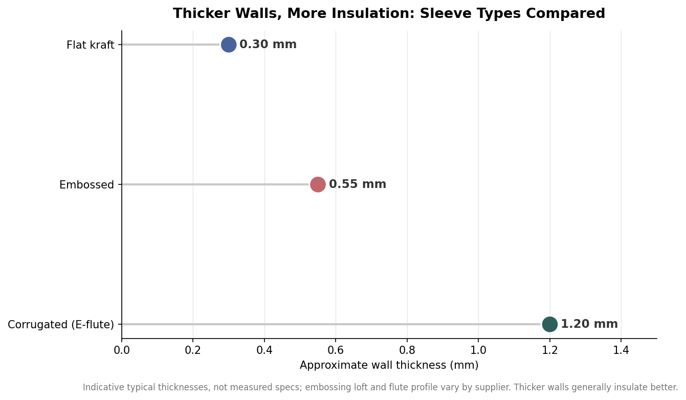
    The practical difference comes down to wall thickness, and thickness is what drives insulation. The chart below shows the rough proportions between the three.

    Dot plot comparing indicative wall thickness of flat kraft, embossed, and corrugated E-flute coffee sleeves in millimeters
    Corrugated construction puts the most material, and the most insulation, between cup and hand.

    Those figures are indicative rather than measured specifications, since embossing loft and flute profiles vary from one supplier to the next. The ranking, though, is consistent: a corrugated sleeve puts noticeably more material between the hot cup and the hand than an embossed or flat sleeve does. If your drinks run genuinely hot and customers hold them for a while, that extra wall is the reason to pay for corrugated.

    What each construction does best

    Match the sleeve to the job rather than defaulting to one type. Corrugated is the choice for a busy coffee bar serving hot drinks that people carry out and nurse, where insulation and a premium feel justify the higher cost. Embossed sits in the middle: the diamond texture adds grip and a tactile, upscale impression at a lower price than corrugated, which makes it popular for cafes that want something more distinctive than plain paper without the top-tier cost. Flat kraft is the value option and the best canvas for detailed artwork, well suited to cooler drinks, lighter use, or campaigns where a crisp full-color print matters more than maximum heat protection.

    Print behavior follows from the surface. A smooth corrugated or flat sleeve gives ink a level, uninterrupted face, so fine lines, small type, and gradients hold their detail. The raised diamond pattern on an embossed sleeve is part of its charm, but that same texture can slightly break up very fine artwork, so simpler, bolder logos tend to look best on it. If your brand mark has thin strokes or small lettering, lean toward a smooth stock.

    Sizing: two sleeves cover almost every cup

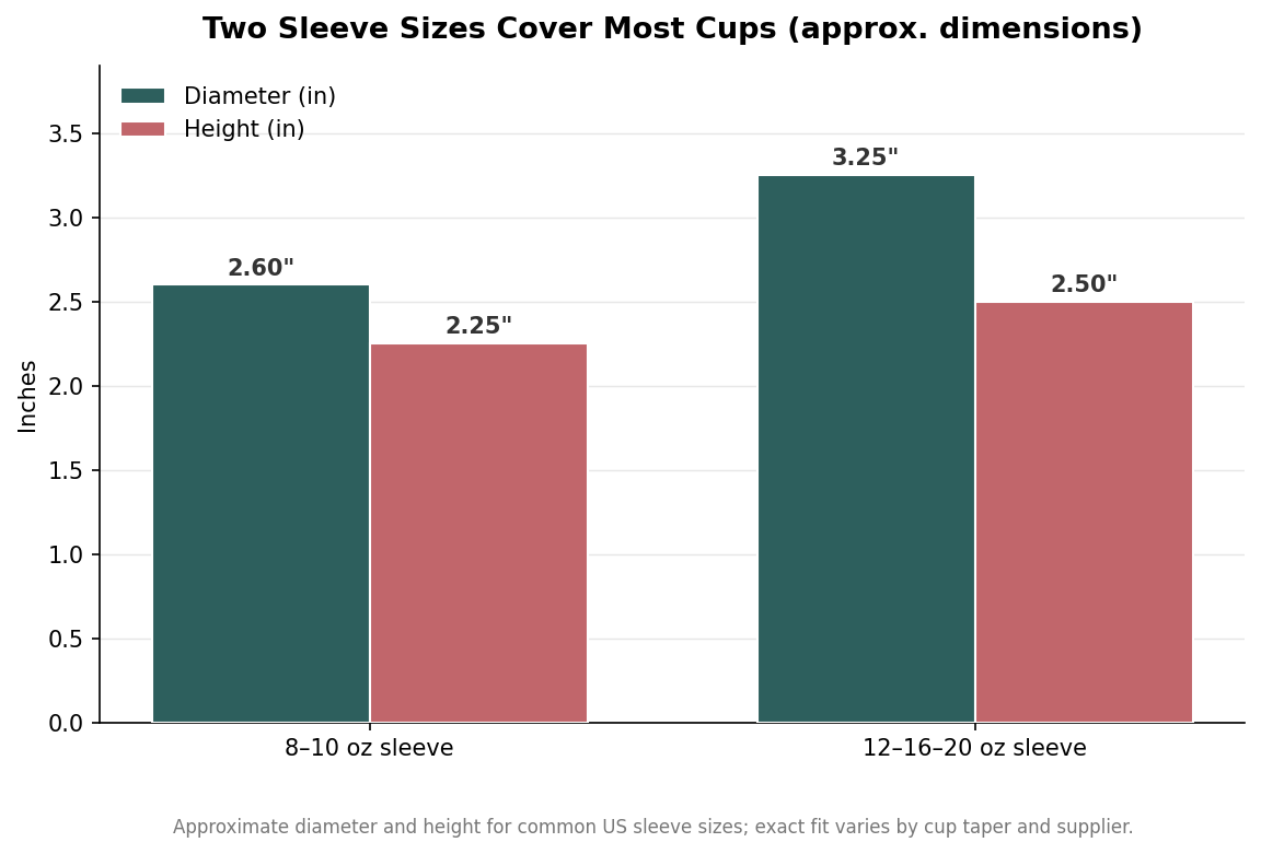
    You rarely need more than two sleeve sizes. A smaller sleeve, roughly 2.6 inches in diameter and about 2.25 inches tall, fits the 8 and 10 ounce cups. A larger sleeve, around 3.25 inches in diameter and about 2.5 inches tall, stretches to cover the 12, 16, and 20 ounce cups that make up most hot-drink sales. Because paper cups share standard tapers, one larger sleeve genuinely spans that whole upper range rather than needing a separate size for each ounce count.

    Grouped bar chart of coffee cup sleeve dimensions for 8-10 oz and 12-16-20 oz sleeves, diameter and height in inches
    Two sleeve sizes span most cups on a typical hot-drink menu.

    These dimensions are approximate, and the real test is the taper of the specific cup you use, so it is worth confirming fit against your actual cups before committing to a large run. As a rule, if you serve a small and a large hot cup, two sleeve sizes will handle nearly everything on your menu, which keeps both your artwork and your inventory simple.

    Kraft, white, and the print decision

    Color choice is as much about print as aesthetics. Kraft brown is the default and reads as natural and eco-minded, but it is a mid-tone background, so light inks can look muted and white ink usually needs to be added deliberately rather than left as the paper. White stock gives a brighter, higher-contrast base that makes full-color artwork and photography pop, at a slightly more processed look. Both are available in each construction, so the decision is really about whether your design wants a warm natural ground or a clean bright one.

    Stock weight sits underneath all of this. Flat kraft sleeves are commonly printed on paper around 270 gsm, a weight sturdy enough to hold shape without feeling flimsy, and corrugated construction adds its fluted liner on top of a similar face stock. Heavier is not automatically better; past a point it mainly adds cost and rigidity, so the weight that matters is the one that keeps the sleeve stable on the cup and comfortable to grip.

    How to specify your sleeve order

    Turn the choices above into a short brief before you request pricing. Name the construction you want and why, based on how hot your drinks run and how long customers hold them. State the cup sizes you serve so the supplier can confirm which one or two sleeve sizes you need. Choose kraft or white with your artwork in mind, and flag any fine detail or small type early so the printer can advise whether your design suits an embossed texture or wants a smooth surface. Finally, ask about minimum order quantities and per-unit cost at a couple of volumes, since sleeves are inexpensive individually but the economics change sharply with quantity.

    Get the construction and the sizing right and the rest is straightforward. A corrugated sleeve for hot, carried drinks, an embossed one for grip and character at a lower price, or a flat kraft sleeve for the sharpest print and the best value, each in the one or two sizes your cups actually need.